SquareSpace in a Round Hole
Things I really, really hate about my Squarespace blog and get to blame on someone else
This King Chill blog runs on Squarespace. I am not sponsored, not affiliated, not really a fan. I recommend it to people for convenience. Also, because social media is making the internet dull, so having your own site is cool.
Also, also, I routinely ask myself why I did not just build this blog in React. I’d save money. I’d get to curate pics and content how I want, not how THE MAN wants me to. Every once in a while, my site would go down for Shabbas.
This is not a Wix, Webflow, Weebly or other endorsement. All the wu-wu-website-builder industrial complex needs a reminder MySpace was better than your thing. Squarespace was just my stubborn decision. I’m living with it.
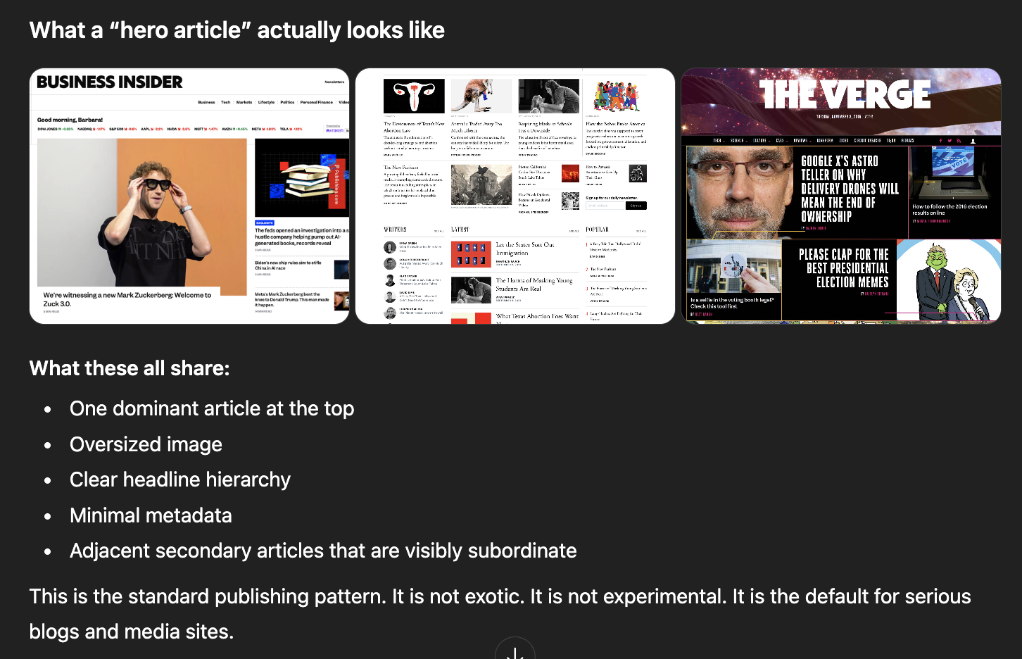
Chat GPT, ‘I can’t show you 3 side-by-side images of those blogs. But here are 3 side-by-side images of the blogs you mentioned with a description you didn’t ask for.’
1. No proper hero article, which is insane
Look at the top of almost any serious blog. Business Insider, The Atlantic, The Verge. One main article dominates the page: large image, large headline, minimal meta. It tells you immediately what matters.
Squarespace does not support this natively.
The official workaround is a “summary block” showing one post. That is not a hero component. It is a hack. A bad hack. It is the Gianmarco Soresi of software components. You cannot properly control image ratios, spacing, typography, or metadata. This alone explains why every Squarespace blog looks the same. Everyone is forced into the same blunt tools pretending to be design choices.
2. The articles next to the hero are just as broken
On bigboy sites—not the kind that require ID in Texas and UK—the hero article is usually flanked by smaller but still prominent pieces. Two to four secondary articles, smaller images, tighter layouts, clear hierarchy.
Squarespace gives you no clean way to do this. Image sizes are rigid. Layout control is blunt. You cannot meaningfully tune visual balance. Everything ends up either oversized or cramped, which again explains why Squarespace sites quietly resemble one another.
They have hundreds of designers. Surely they can think outside the box/square for two seconds and figure this out.
3. No control over content selection or ranking
You got your “most recent” and you got your “featured.” That’s it.
No ranking logic. No rotation. No randomness. OK, you can say “this week, show posts with this tag.” if you reconfigure summary blocks, manually and clumsily. It’s oddly primitive and sucks for getting evergreen content circulating.
But wait, it gets worse!
4. Fixing problems costs extra
If you know CSS or design, Squarespace charges you more to work around its own limitations. There’s no, “here is where you add CSS or JS like you did on MySpace for free!” You are actively disincentivized from improving your site unless you upgrade.
Want to add a cool third-party widget? Good luck.
Want to make a random content picker with JavaScript? No chance.
Want to build a reusable component, like the hero card that, somehow, they do not offer? Hahaha. You fool!
You save money only if you accept the defaults and stop thinking. Let your blog be Substack that costs you money.
5. Tagging and categories are borderline unusable
Tags are invisible until you start typing. There is no grouping, no hierarchy, no overview. In version 7.1 there is even a checkbox next to tags that appears to exist for no discernible reason.
Really, they have a checkbox that does nothing on the ‘chips’ you have to find.
Tags exist to organize content. This system actively resists organization. For whatever reason, SquareSpace refuses to hire a very junior dev to help with this feature, and the product managers refuse to acknowledge it.
6. Fake modularity
Squarespace loves to talk about modular design. In practice, it is rigid. It does what the other website makers do: provide a finite list of Lego blocks to play with. Again, you can not paint the Lego without paying extra (see #4).
So you cannot easily move the menu to the left. Top or right.
You cannot embed a search bar into navigation.
You cannot treat navigation as a true component system.
Website makers feign flexibility while enforcing a very narrow set of layouts.
Conclusion
Here is a simple idea for Squarespace: look at the best blogs on the internet. Try to reproduce their structure without hacks. The reason sites do not migrate to Squarespace is they lose core functionality. So fix it already.

